← home

product design • ui/ux design • healthcare

Gpq: Simplifying the process of finding and seeing a doctor

GPq is a mobile app that helps users find nearby GP clinics, check crowd levels in real time, and hold a queue spot without leaving home, designed during the COVID-19 period to minimise unnecessary exposure.

Course Coursera - UX Design Fundamentals
My role UX Research, Interaction design, Prototyping
Platform Mobile (iOS)
Timeline 3 weeks (June - July 2020)
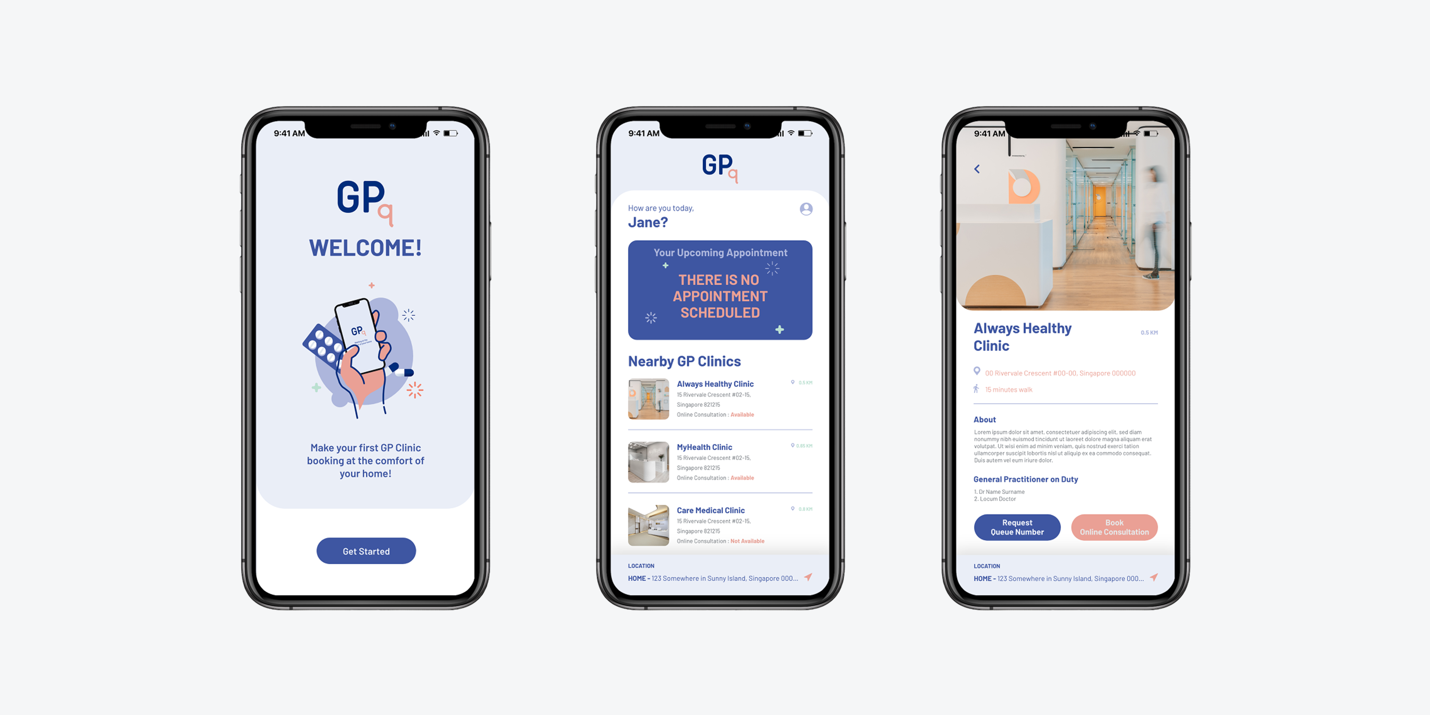
GPq mobile app mockups showing clinic finder, crowd levels, and queue booking screens

Context

During the COVID-19 pandemic, visiting a GP clinic carried real risks beyond the illness itself, crowded waiting rooms, prolonged queuing, and the discomfort of leaving home while unwell. For caregivers and working adults, even a short clinic visit meant disrupting routines and exposing themselves or dependants to further risk.

This project explored whether a queue management and tele-consultation app could meaningfully reduce those friction points. It was designed as a 3 week coursework project under Coursera's UX Design Fundamentals programme.

“How might we help people in Singapore manage GP visits more safely and conveniently, so that being unwell doesn't mean hours spent waiting in a clinic?”
Qualitative research insights

I conducted interviews with two potential users, using open-ended questions to surface attitudes, habits, and frustrations around GP visits. Responses were organised using an affinity diagram to identify recurring themes.

Two personas were built from the findings, representing the distinct contexts and constraints of each user type.

Caroline Tan, 34

  • Role: full-time housewife, former office worker
  • Family: married, two children aged 1 and 4
  • Location: heartlands of Singapore
  • Challenge: can't leave toddler unsupervised; mornings entirely taken up by family routines

Harriz biz Azmi, 27

  • Role: civil service employee
  • Lifestyle: active; gym and social commitments outside work
  • Location: heartlands of Singapore
  • Challenge: values speed and practicality; dislikes disrupting his routine

Who we designed this for

Both users shared overlapping frustrations, despite living very different daily lives. The consistent thread was the unpredictability of the clinic experience, and the cost of that uncertainty on time and comfort.

01 No way to gauge waiting time before arriving

Users couldn't check clinic crowd levels remotely, making it hard to plan when to go.

02 Queue number ≠ guaranteed wait estimate

Receiving a number didn't mean knowing how long to wait — users still felt compelled to stay on-site.

03 Cramped waiting environments

Small neighbourhood clinics with limited seating made waiting uncomfortable, especially while unwell.

04 Infection exposure risk

Sitting alongside other patients heightened concerns about contracting secondary illnesses.

05 Caregiving constraints

Leaving home while managing dependants, particularly a toddler; added significant stress on top of being unwell.

06 General discomfort of going out while sick

The act of travelling to a clinic when feeling unwell was itself a barrier to seeking care.


Understanding the real pain point

Rather than eliminating clinic visits, GPq focused on reducing waiting time by allowing patients to queue remotely and travel only when it was time to see the doctor.

Give users the ability to check clinic availability, hold a queue spot remotely, and consult a doctor online, so that physical visits only happen when truly necessary, and on the user's own terms.

🔍 Clinic finder with live crowd data

Users can locate nearby GP clinics and see current queue levels before deciding whether to go.

📲 Remote queue booking

Secure an appointment slot and wait at home, the app notifies users when their number is approaching.

🔔 Smart queue notifications

Push alerts (and optional clinic callback) let users time their departure accurately, removing the need to physically wait on-site.

🩺 Online video consultation

For common ailments that don't require physical examination, users can consult a doctor via video call — eliminating the clinic visit entirely.


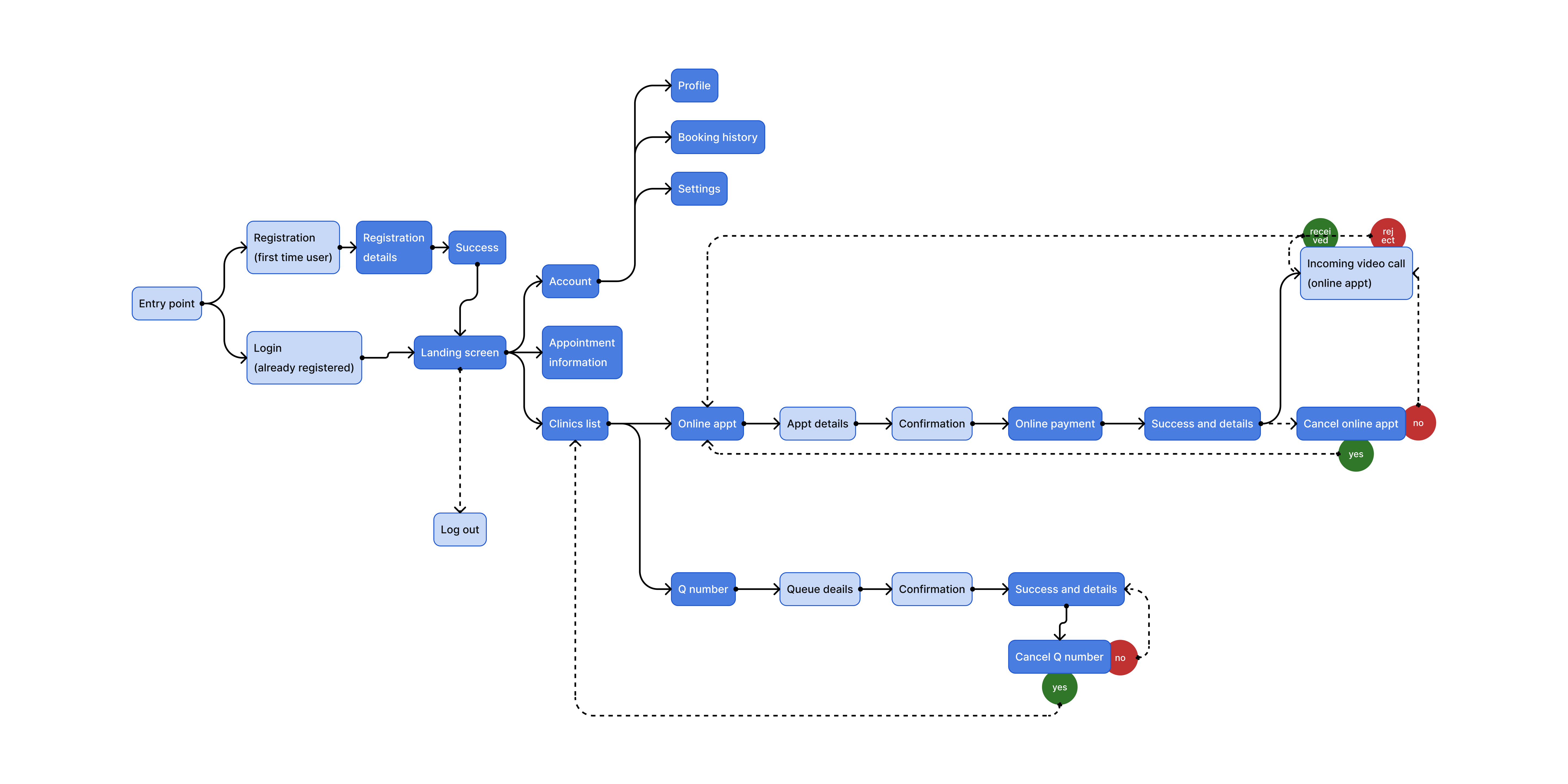
The flow was mapped around two primary paths: queue booking and online consultation. Both user flows start with a clinic search based on the user's location.

GPq user flow diagram showing queue booking and online consultation paths

Wireframes

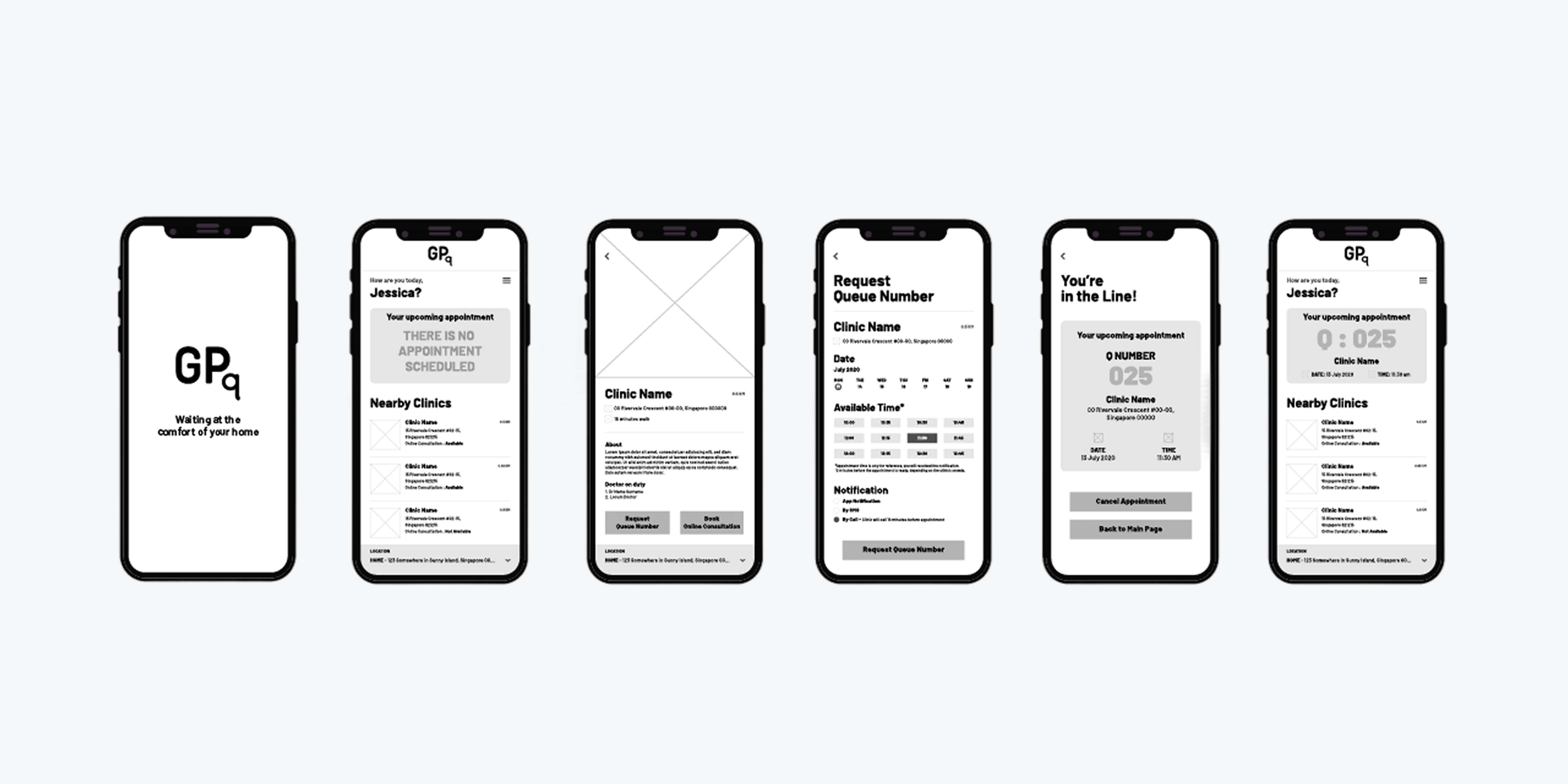
Lo-fidelity wireframes were built first to validate information architecture and screen sequence before committing to visual design. Key decisions at this stage centred on the booking confirmation flow and notification settings.

GPq lo-fidelity wireframes showing six mobile screen layouts

Reflection

This was one of my first end-to-end UX projects and an important step in developing my design approach. Although the scope was limited, it reinforced key principles that still guide my work today: understanding user needs, prioritising core problems, and making decisions backed by clear rationale.

Looking back, I would validate the notification timing through user testing and explore ways to further simplify the tele-consultation flow for users who may be unwell. These opportunities highlight how user feedback can continue to improve the experience beyond the initial design.